Kitchen Plans and Progress
Hi there! I hope you all enjoyed your weekend – and your Monday! We managed to make a little headway on our kitchen renovation this weekend. We installed the hardware and the pendants, and I’m really happy to have that done. The countertops were templated last week, which means that we’ll be getting the call to set up our install appointment any day! Yay! Things are moving along, not quite as fast as I wish they would, but we’re making progress 
But before we get into all of that, I wanted to share something with you. As I was mentally ‘writing’ this earlier, my mind kept wandering back to a photo that I saw years ago that really resonated with me, and I knew that I wanted to make it part of this post. Awhile back, someone I’m friends with on Facebook posted a photo of a woman cooking over a fire in a kitchen with a dirt floor.
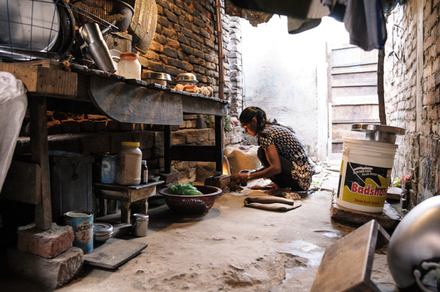
This isn’t the exact photo, but it’s similar. And it was captioned with something like, “May I never forget that this is the kitchen she cooks in everyday.”
We’re so fortunate to have what we have in this country, and I think it’s important to keep that in perspective and not get lost in all of the glitter. My ‘gift’ with decorating has, in a way, always been a struggle for me. For a long time, I felt like the thing I did best in life was inconsequential and materialistic, and I hated that thought.
I’m not a materialistic person, and I didn’t want to be perceived as one. Creating, decorating, designing. All of these things have always just been an outlet, a sort of therapy for me. And I love knowing that I helped to create a space that brings people comfort and a bit of joy. I said this to a friend one day, and she said something that changed my outlook.
She said, “Hey, God’s a designer too. He clearly loves beauty, and He’s not materialistic!” I’m not sure why, but that thought somehow helped me to reconcile the way I’d been feeling.
But anyway, this isn’t meant to be a heavy post! And I most definitely do not want to make anyone feel bad about creating lovely and comfortable homes. That’s what I do, afterall!
I think that creating a space that’s warm and welcoming is a gift that we give to our families and to all of the friends and loved ones that we welcome into our homes.
But I also like to try and remember that while beautiful, functional spaces are fabulous (and I’m so thankful to have the chance to change mine up a bit, and work in a field that I love), the things that are most important in life, aren’t things. And my mission everyday is to try my best to never lose touch, or forget to approach everything I do with gratitude ?
So anyway, on that note, I’d like to dive in to some of the kitchen progress we’ve made, show you some of the spaces that have inspired me, and share a few ideas that I’d like to incorporate into our updated kitchen with all of you! Let’s get started!
Here’s a couple of photos of what went on this weekend.
A pretty sconce is hung above our sink now… No need for my husband to hold it in place as I take pictures anymore!
Which reminds me, if, like us, you are in the process of a kitchen renovation project and are thinking of investing in a farmhouse sink, then you must take a look at this useful guide from Annie & Oak: www.annieandoak.com/blogs/design-style/farmhouse-sink-materials-an-in-depth-look-pros-and-cons. Finding a style that you like best is so important if you want to give your kitchen a unique finish.
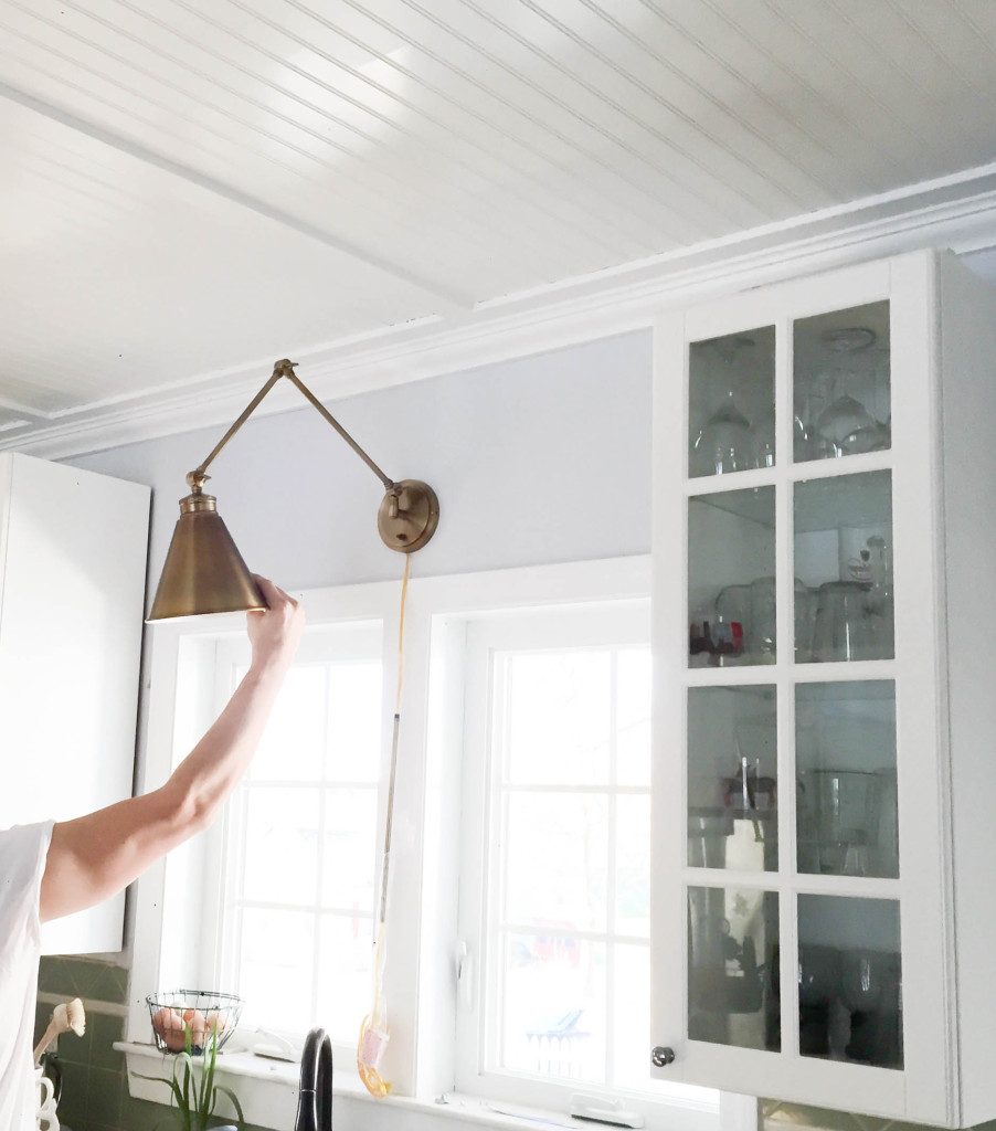
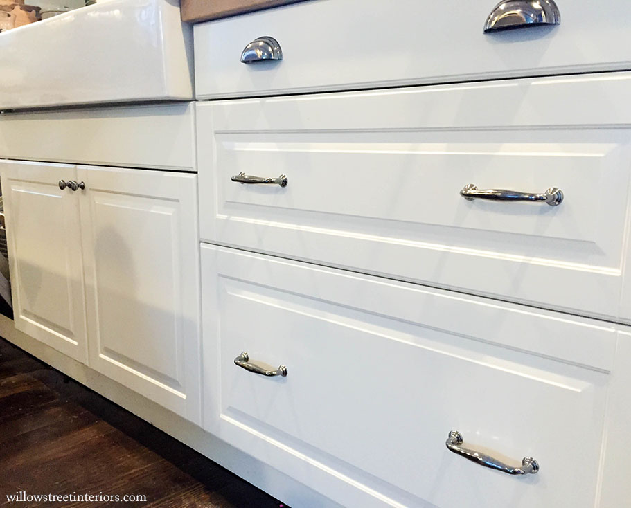
The cabinet hardware is installed…
and the pendants are up, but there’s still {clearly} a little fine tuning that still needs to be done… Ok, I know I’m not showing you all that much here, but honestly, this is one of those projects where each little part of the design is critical to the overall plan, and I don’t want to lose any of you!
There’s a fresh coat of paint and some pretty lighting up, but see the green backsplash that’s still on the wall? It c o m p l e t e l y clashes with everything else that’s going on. There’s also half of a vent hood above my cooktop! And, in all honesty, if any of you have a hard time seeing the vision until a project is almost complete, you’d most likely never come back to my blog if I showed you all of the details in this room right now 
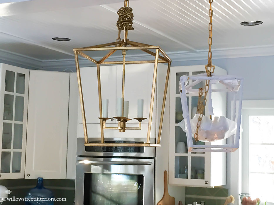
What do you think of the lanterns?! And how do you feel about the aged brass?! I had such a hard time deciding on what I wanted to do for lighting here. There are SO many pendants that I absolutely LOVE for a kitchen. Ultimately, I chose to go with lanterns, particularly brass, because I love that they’re traditional and farmhouse-y, but the aged brass makes them feel a little more elegant, and the clean lines on these give them a little modern flair. Have you seen lanterns in a kitchen before? They get loads of heart eyes from me! 
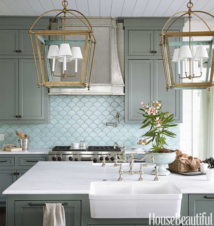
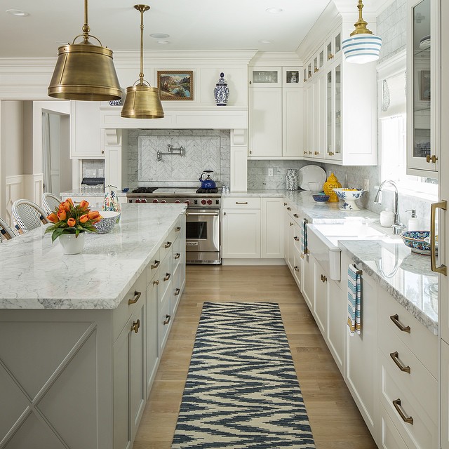
Can you see those lanterns hanging off to the left in the photo down below? And that wall! We’re not doing anything like it in our kitchen, but it’s super pretty, isn’t it?
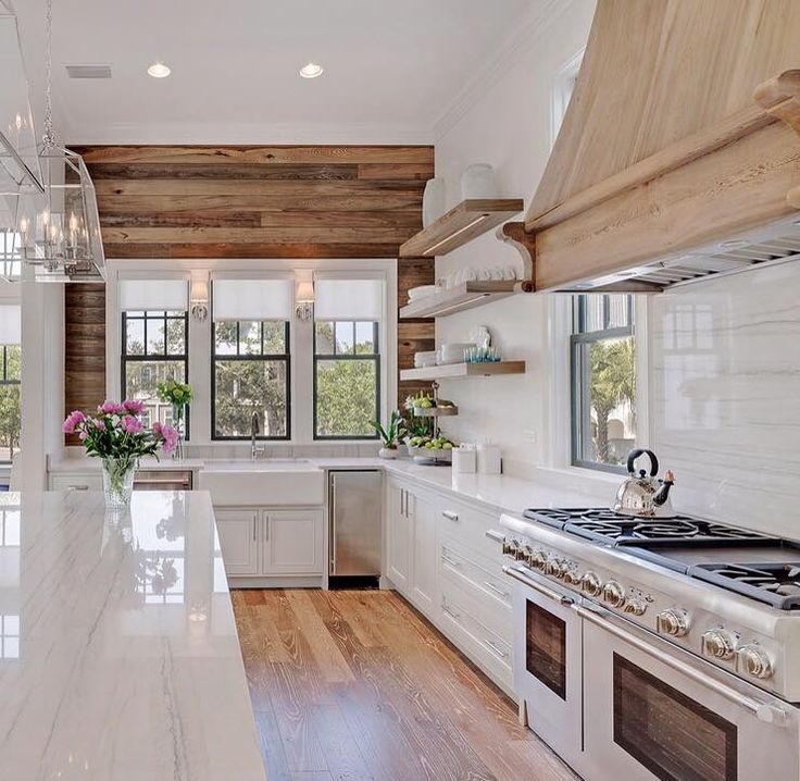
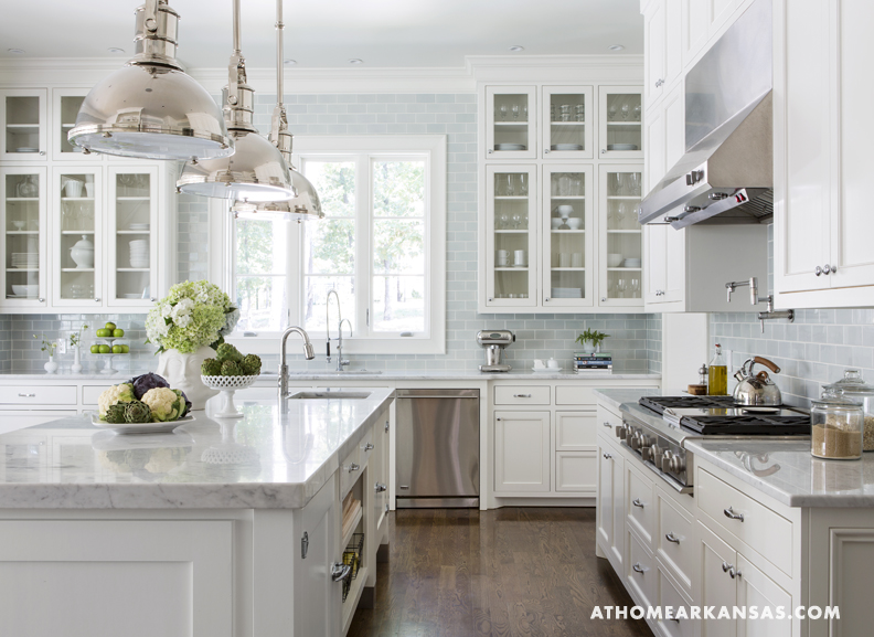
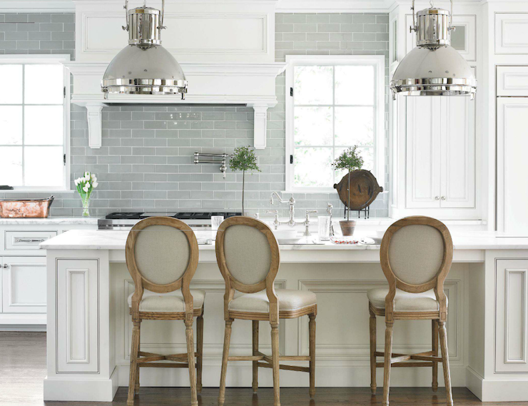
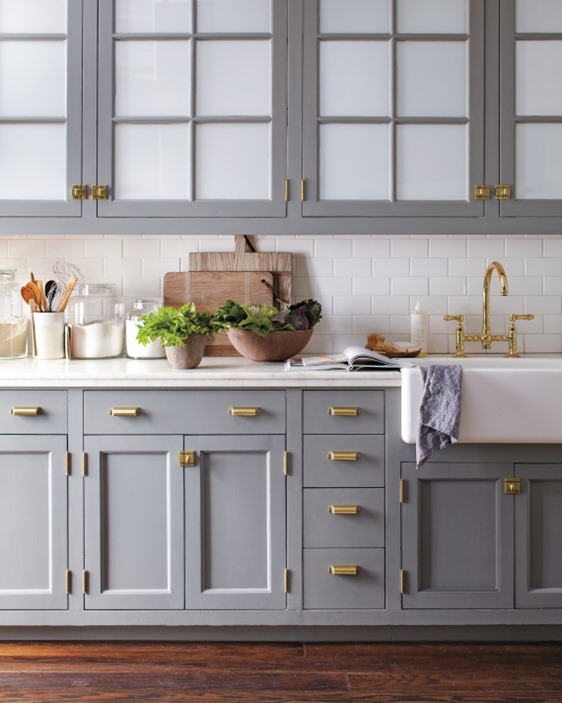
Michael’s really never been on board with an all white kitchen, which would be my dream, but I understand that ‘all white’ isn’t for everyone, and I can absolutely appreciate lots of different approaches when it comes to design. I think for me personally, white is just the perfect canvas because I like to change up decor so often! But anyway, my job for our kitchen was to come up with a plan that we’d both be happy with. So I decided to go with a gray/barely blue subway tile, and I am so excited to see it go up. None of the photos below look exactly like the tile we’re going with but they’ll give you an idea of what a light neutral tile can do for white kitchen cabinetry.
Here’s an example of what glazed ceramic subway tile looks like…
and an example of gray/blue glass subway tile….
And here’s another example of aged brass fixtures in a kitchen….
more aged brass…
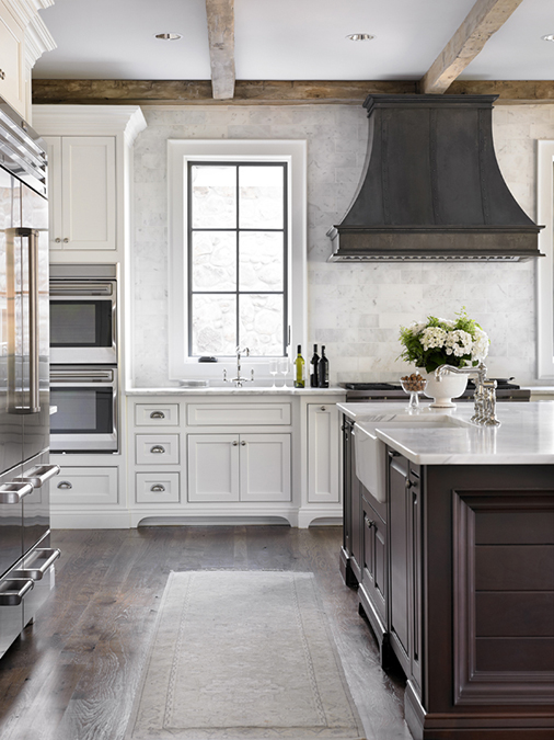
I’m also loving the look of curved vent hoods! I’m {hoping} my husband can find a way to DIY this, and when he does, I’ll share it with all of you! I LOVE the shape of this one…
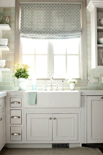
And last, but not least, I’m planning to install some pretty, patterned, roman shades, but I’m still undecided on fabric. I’m in love just thinking about the pattern and soft texture that they’re going to add to all of the smooth, shiny, metallic surfaces though!
Wishing you all an amazing rest of the week!
Laura ?



I’ve never been a fan of brass until now! You are incredibly talented, have an amazing outlook on your talent and seem incredibly down to earth and kind. I look forward to revisiting your blog over and over!
Oh, wow, what a sweet comment, Stephanie! Thank you! I just popped over to your blog for a second, and I can’t wait to get done with laundry so I can sit down and really read your posts… So lovely! <3
Laura,
I really liked your post about inetrior design and materialism. I think you put it in perspective very well. Interior design is a creative outlet for many and a highly creative occupation for some. In this fast moving, sometimes impersonal world we inhabit, our homes are our refuge, a place where we live the major part of our lives…and having a home that’s comfortable, warm, filled with things you love and designed for the way you your family lives can’t and shouldn’t be underestimated.
Oh, thank you so much Kathleen! What a sweet comment. I agree, home really is a refuge and the more we fill it with our memories and treasures, the more surrounded by love we feel! Thanks for popping in
Great choice on the lanterns/. I didn’t know I loved brass, but apparently I do! I’m excited to see your back splash and what you come up with for the hood !!
Thanks, Katherine! Deciding on lighting was such a hard choice, but I’m really happy that I went with these And I’m hoping we can tackle the hood as soon as work calms down a little for my hubby
  I’m glad you stopped by! Enjoy your day!