eDesign Redesign Shared Playroom Reveal
Hey Guys! I hope you all had a great week! I’m popping on today to share a few photos of this sweet project that I finished up recently.
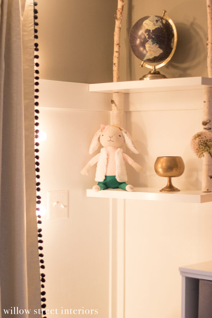
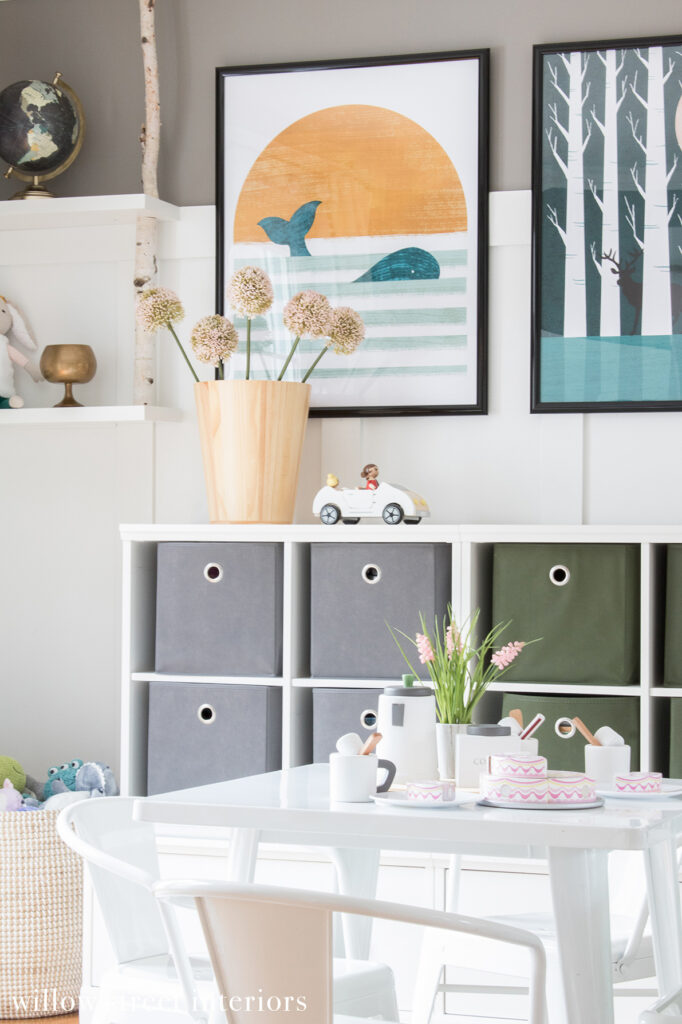
It’s an adorable shared playroom, and if you’ve been following along for awhile, it may look familiar to you!
This is actually the same playroom that I designed back in 2015. It looked like this, when I finished it up, back then…
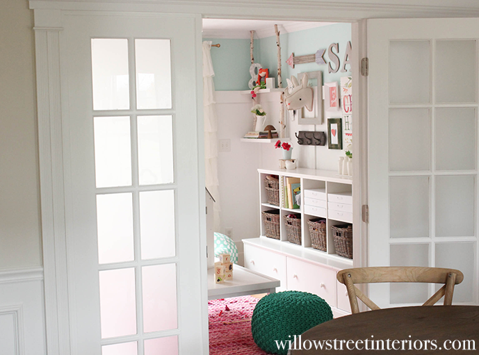
You can see the rest of the previous version of this space here.
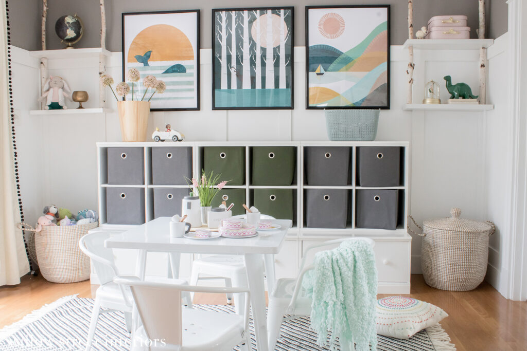
The original design was whimsical and super girly, since the space was only being used by one, tutu and glitter obsessed, sweetie pie, at the time. This family has since added a boy to the mix, and my task was to bring in some fun, masculine details, and a new color scheme that felt inviting to both kiddos, without breaking the bank.
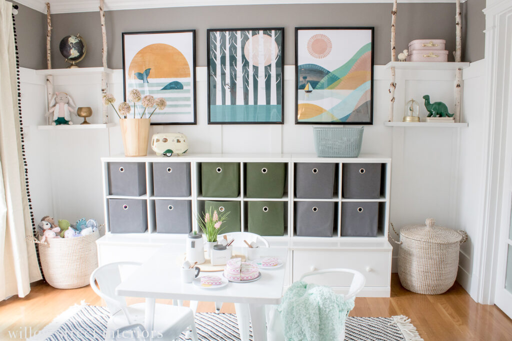
I couldn’t be happier with the results! I added in a new rug, paint color, artwork, and bins, and it completely transformed the room.
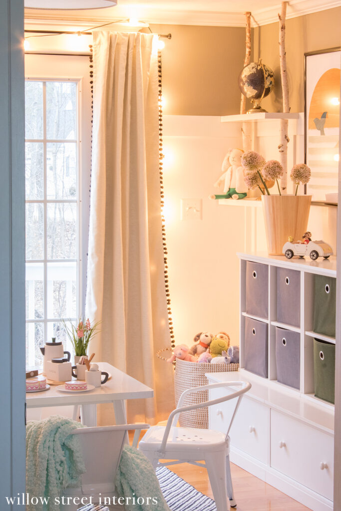
We also strung up some globe lights around the patio door and I think the room looked even cuter when it started to get dark outside. Single source overhead lighting can be pretty harsh and unsoothing, which isn’t ideal in any space, but definitely not a playroom. The ambient light from the string lights feel magical, and I’m obsessed!
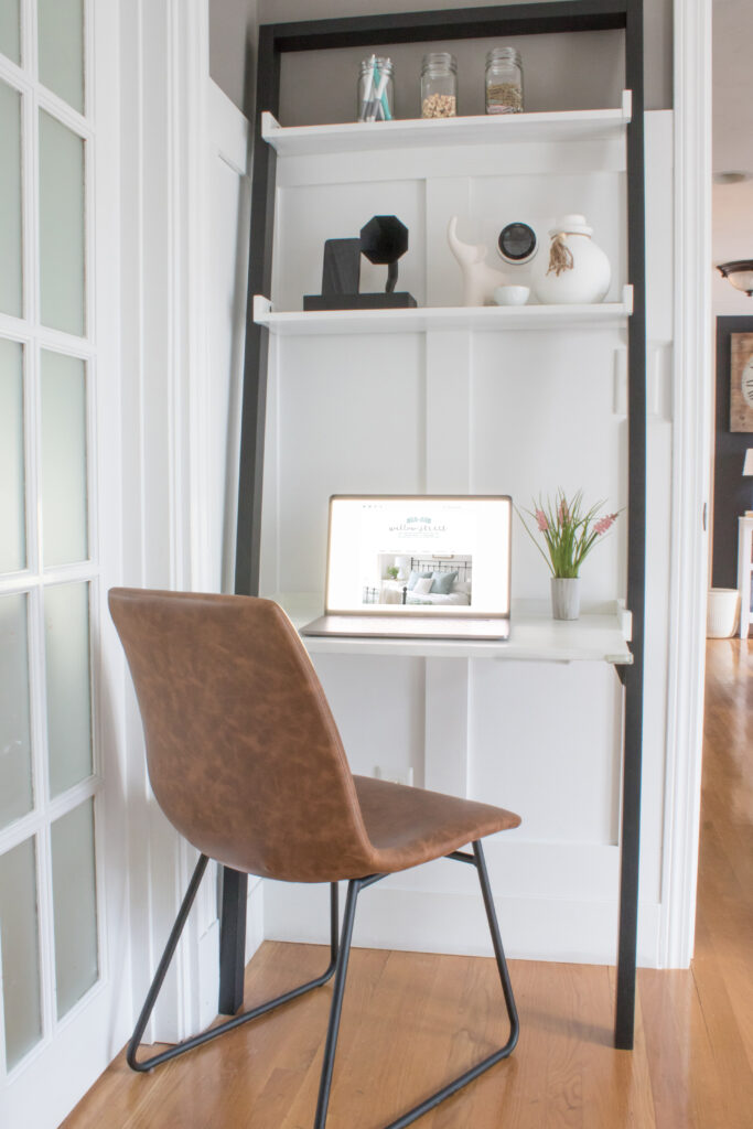
This is going to be such a perfect homework corner in a couple of years, but for now, it’s a great, tucked away, spot for Mom to check her email. The desk is no longer sold, but I’ll link a similar one!

[show_lookbook_widget id=”441886″]
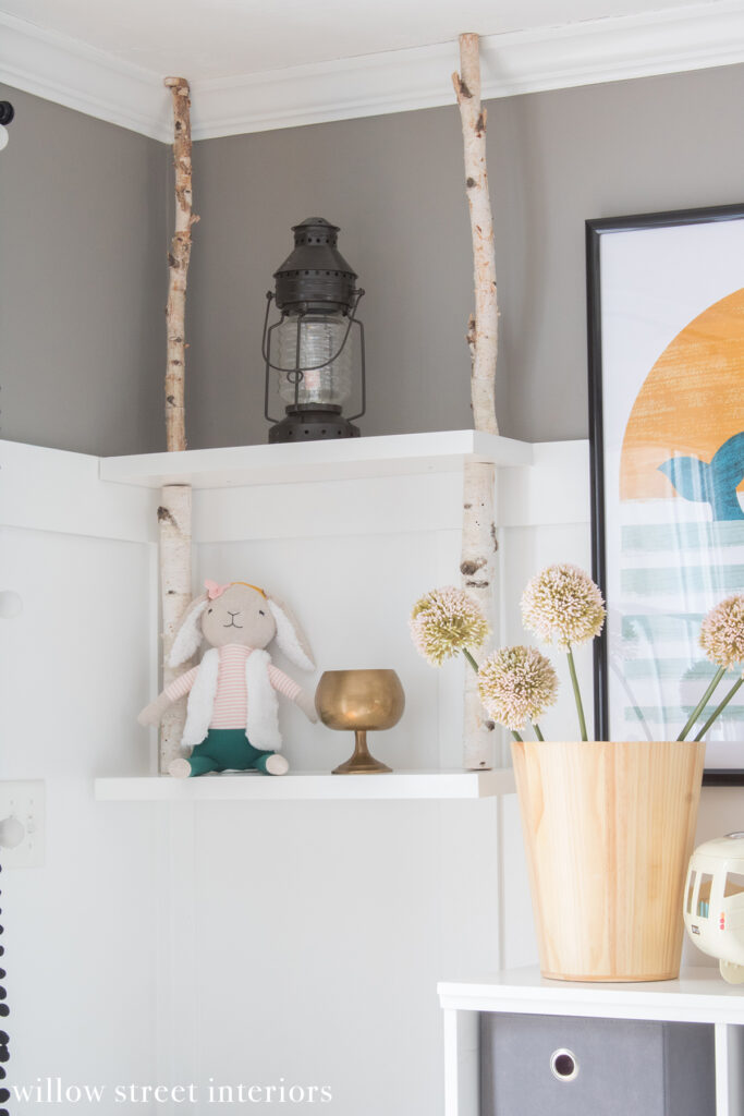
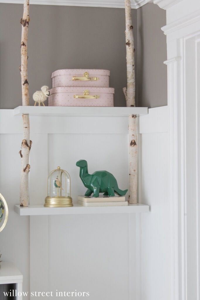
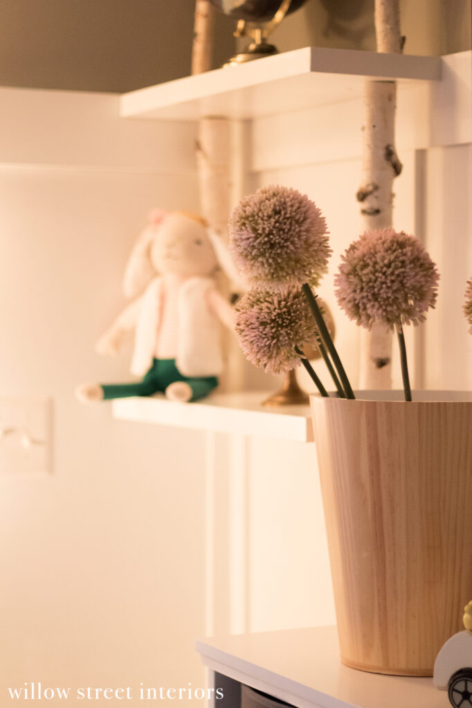
I was obsessed with this cute birch branch/shelf idea that I came up with for the original room. It was a DIY, because nothing like it was made back then! It’s simple IKEA shelving with birch branches from Michael’s cut to fit. But if DIY isn’t your thing, you’re in luck because Pottery Barn Kids now makes something pretty similar.

[show_lookbook_widget id=”441886″]
And that’s about it, Guys! Wishing you all a wonderful weekend!
XO, Laura


Awesome post! Keep up the great work! 🙂