My Home Style Blog Hop {Before + After Edition}
Hi there, Everyone! If you’ve just popped over from Domicile 37 or are visiting me for the first time today, hello! Welcome to my little corner of cyberspace. I’m so happy that you’re here, and I hope you’ve been enjoying the incredible lineup of home decor inspiration as much me this week!
I’ve been loving the chance to get to ‘visit’ and be inspired by so many different bloggers, and by so many beautifully different styles over the course of the last few days. I enjoy decorating and I have seen a lot of talented bloggers whose ideas on where you can get furniture for your office will leave you feeling inspired!
If you’ve been a reader here for awhile – {welcome back, and thank you!} – and you’re not quite sure what I’m talking about, let me explain.
Stephanie, over at Casa Watkins Living, started the My Home Style Blog Hop last year. Before talking about that, if you are interested in purchasing some real estate then you may want to check out The Florence Residences Condo. For a week, she and loads of other talented bloggers share some part of their home style and give you tips and sources on how to achieve a similar look in your own space. This year, Stephanie asked us to showcase how our homes and styles have evolved and changed over time {boy, do I have some before and afters for you!}, and to define our home style in 3 words.
When I started brainstorming how I’d go about defining my style, I have to say I was stumped. That sounds pretty sad coming from an interior designer, but I’d honestly never tried to define my own style before. I do it for clients all of the time, but when it comes to my own design personality, I’ve just never given a definition much thought. I definitely have an appreciation for just about every style out there, and I tend to mix styles pretty often in my own home. Does that make my style eclectic, transitional?
I laid in bed one night thinking about exactly which 3 words would best describe my design sensibilities, but none of the traditional definitions felt quite right. And then it came to me. I ‘ll just look at the photos I’ve taken of different spaces in my home, and see what design elements stand out most to me.
So I did that, and there it was.
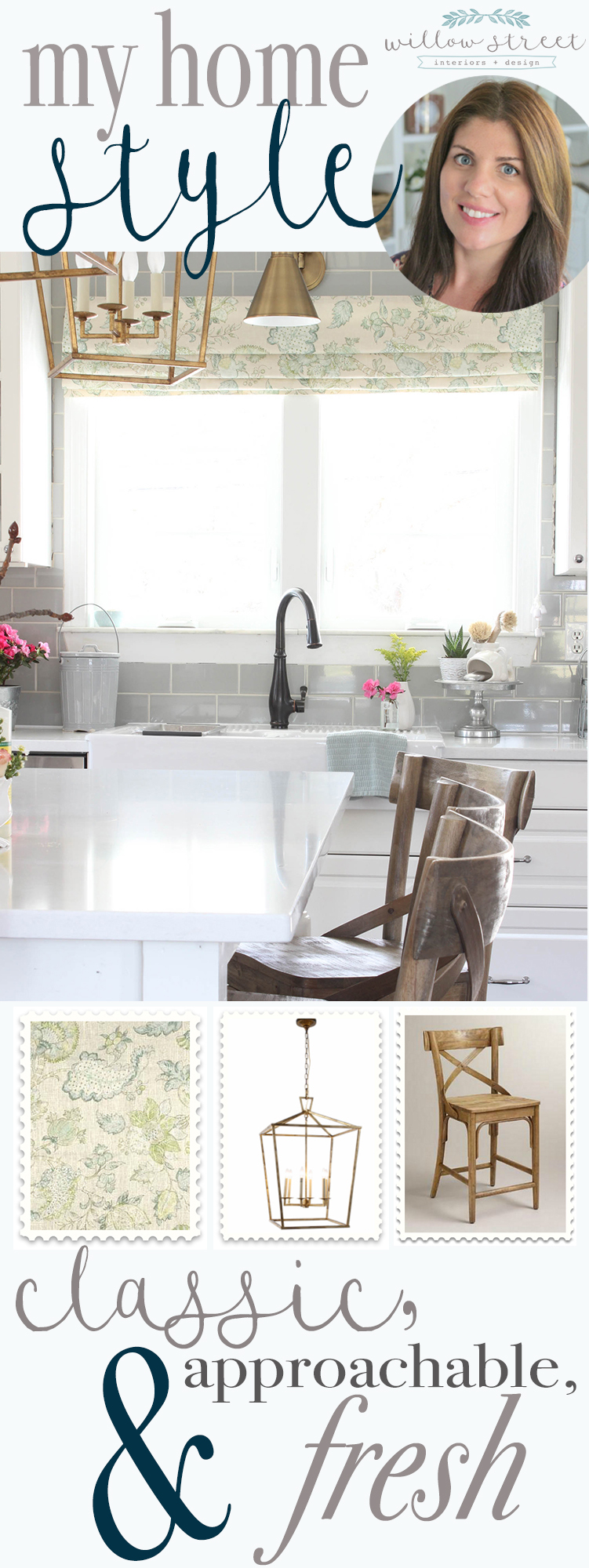
My home style in 3 words. Classic, approachable, and fresh.
I love to take a fresh approach to classic, casual styling, inserting a trend here and there, but always falling back on timeless design.
Boom. My style, defined!
So now that’s done? let’s see what classic, approachable, and fresh actually looks like put to use.
Are you ready for some before and afters?
Let’s start in the kitchen!
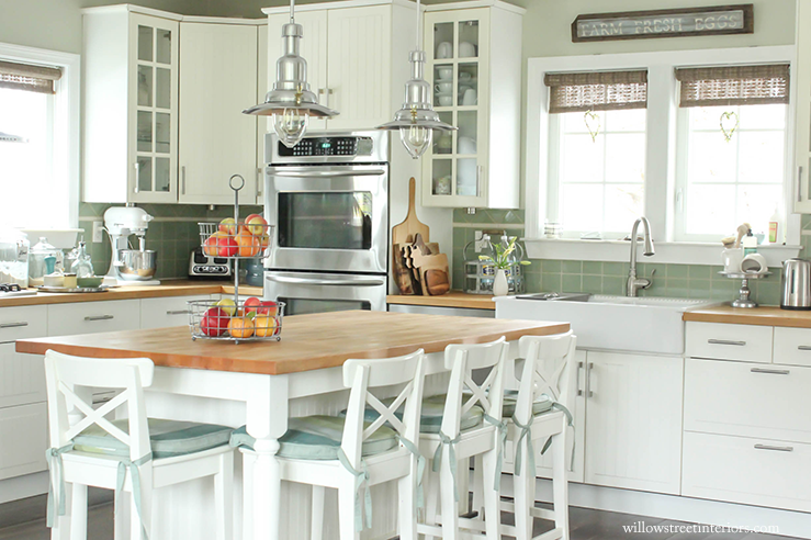
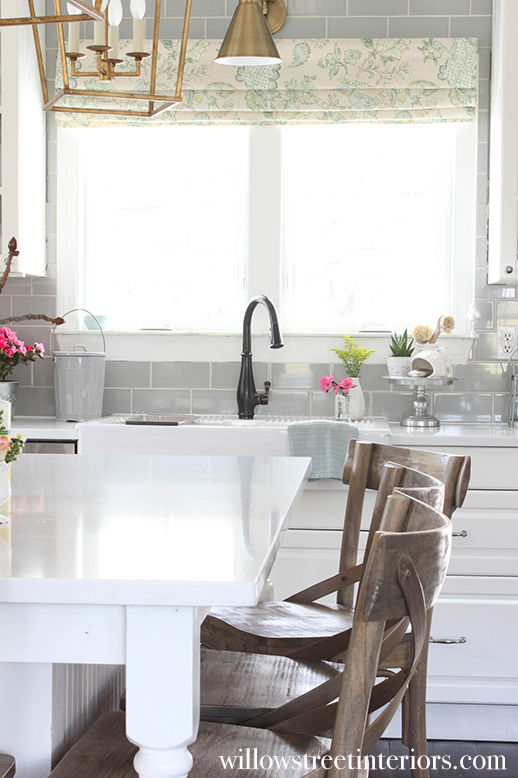
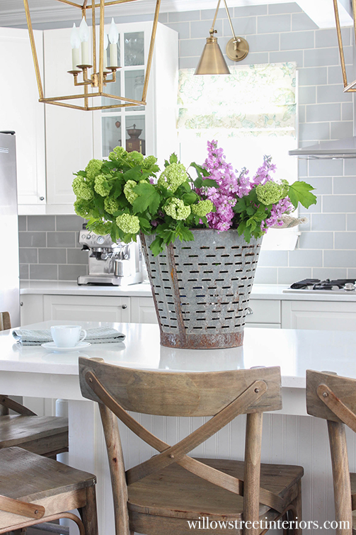
We redid our kitchen last winter {we still have some loose ends to tie up, but it’s 90% there!}. You may not notice, but we have integrated a lot of tech into this kitchen which makes it easier for us to prepare our favorite meals. We’ve installed the best induction hob and a state of the art coffee machine so that we can have eggs and coffee on those tough mornings as well as so much more. It’s now my favorite room in the house! For the full backstory on why we redid it, click {here}. It involved an IKEA fiasco that ended well!
BEFORE
AFTER
And our living room…
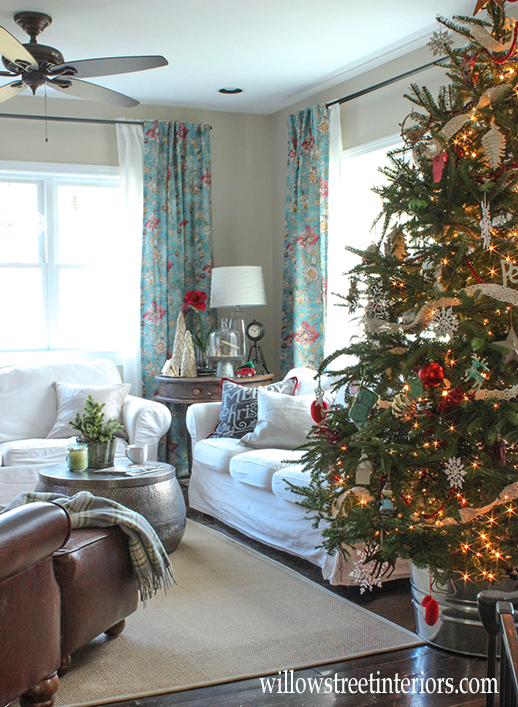
BEFORE
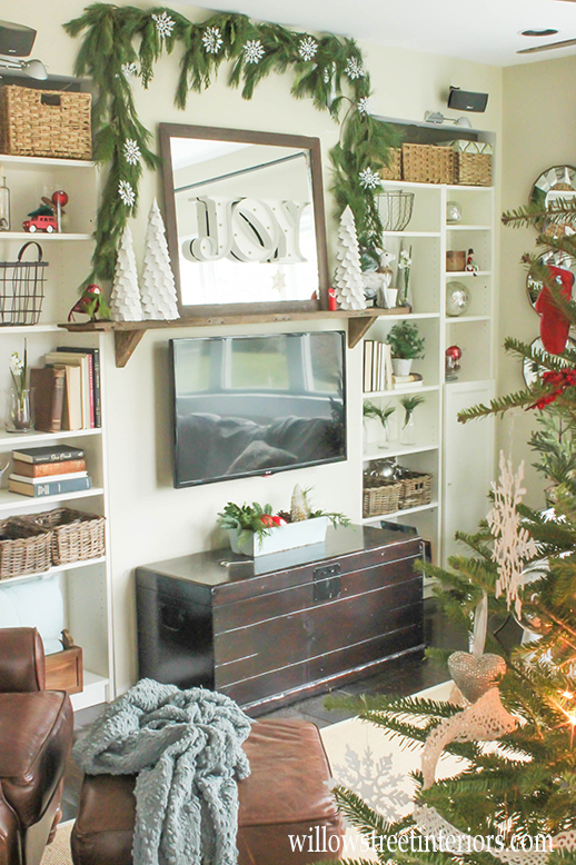
I know, I know, it’s kind of strange for me to use Christmas photos as before shots, but I started blogging a little over a year ago, and these are the only before photos that I have of this room!
If you look closely, you can see how I was trying to mask the fact that the built ins weren’t completely built in by putting those baskets on top of the shelves.
BEFORE
In all honesty, our old living room was pretty cozy. Especially at Christmas when lots of greenery and soft accessories could hide all of its blemishes. But those unfinished nooks and crannies had become an invisible burden that my husband and I didn’t realize were bothering us so much until we finished them!
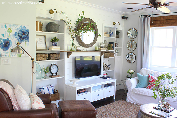
Here’s what our living room looks like now…
AFTER
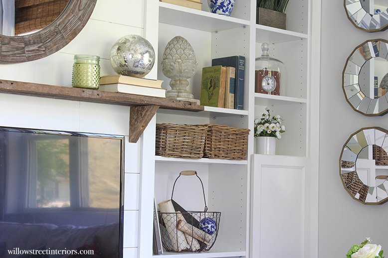
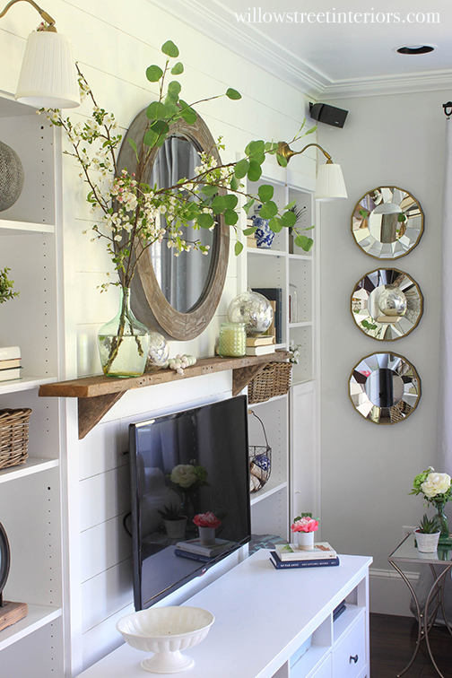
After 8 years of living in our house {which we gutted to the studs when we moved in}, we finally put the finishing touches on this room last spring. The beige went away, we added crown moulding, wall sconces, and shiplap, finished the built ins, and I freshened up the decor for spring! And I just LOVE the soft light that the sconces throw at night now!
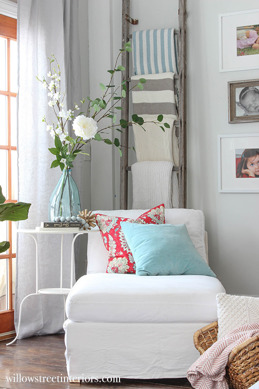
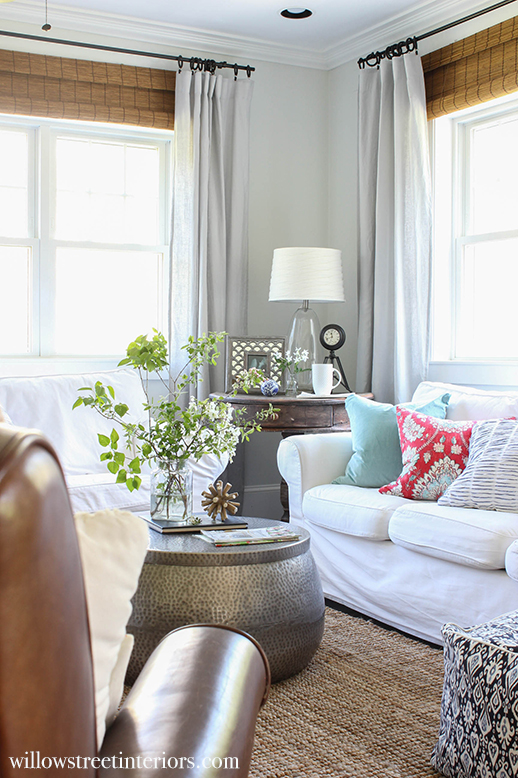
More AFTERS…
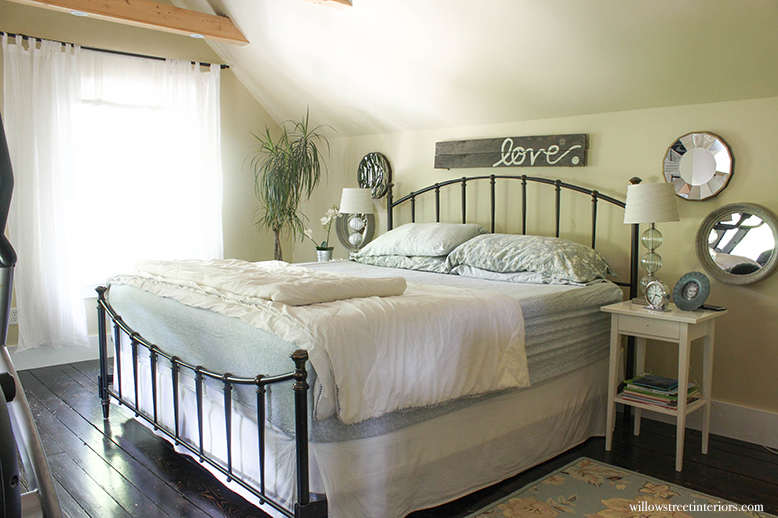
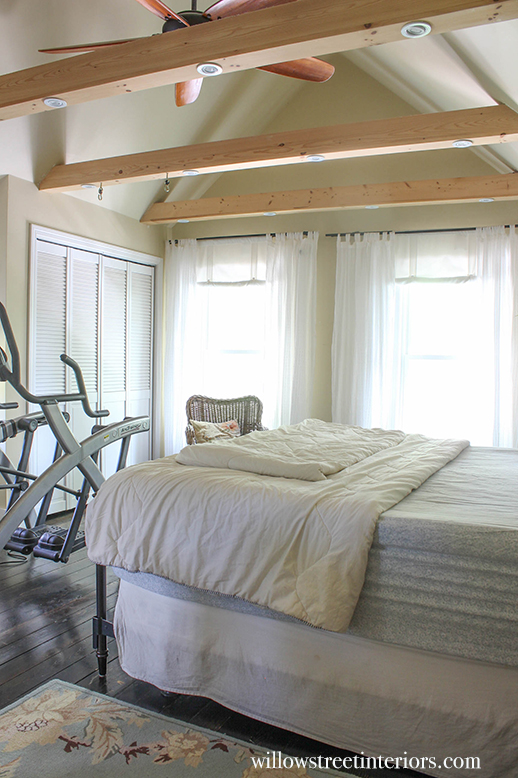
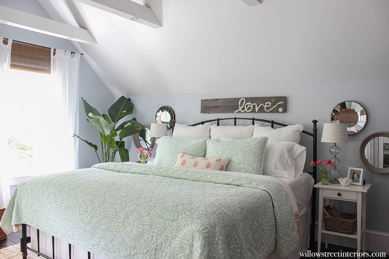
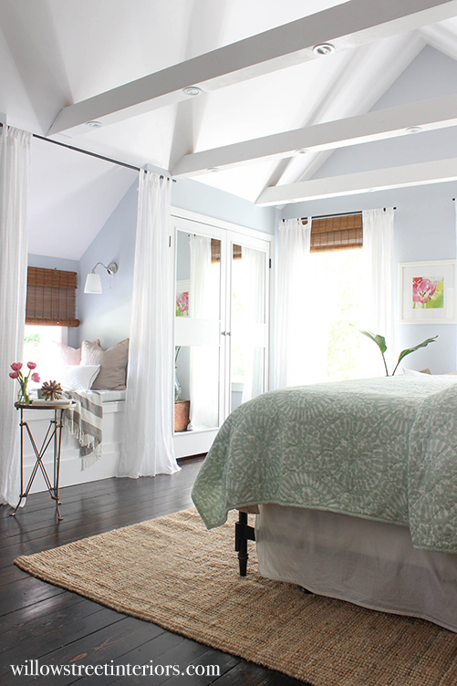
Ok, and on to the last space that I’m going to share with you today. Our master bedroom. We just finished this one in July, and boy, it felt long over due!
Ready for the tragic before photos?
Oh gosh, they’re embarrassing, you guys!
BEFORE
BEFORE
This room, as you can see, was very unloved. Classic case of mommy and daddy putting everything and everyone else first. I mean, do you see those leftover, high water curtains that I had hanging in there? I’m sorry folks! Just look away 😉
You may also notice a trend emerging in all of these before photos. Lots of beige, right?!
When we first moved in, we were still waist deep in our renovation, and didn’t have the budget to decorate. I had no idea which direction the majority of our rooms would take design wise, so when my husband asked what colors to paint everything, I said, “WHITE!”
and he said, “absolutely not.”
So we went with beige, as you can see.
It’s exciting to finally be at a point where we’re ready to add some personality, and tie the loose ends together in our house. And I’m so happy that we have a finished master bedroom! Oh right, I was going to show you that!
Here it is, folks…
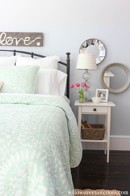
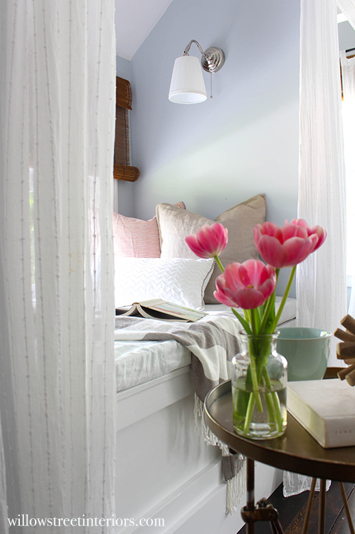
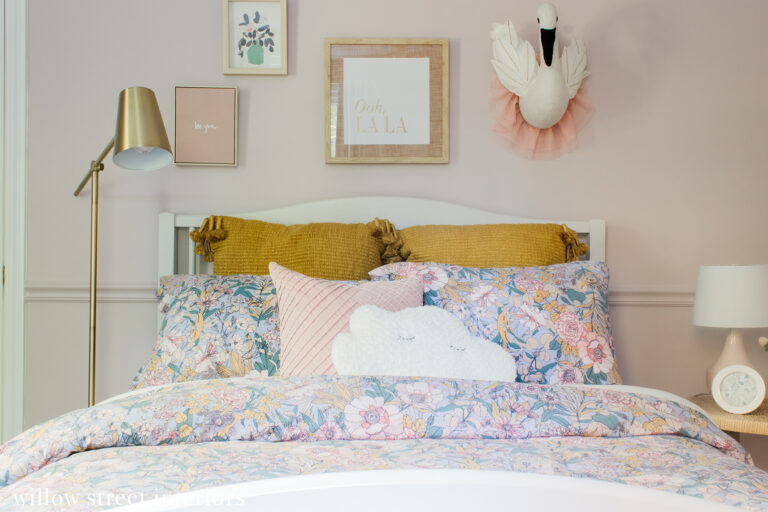
AFTER
Our home has definitely evolved since we first moved in. It’s brighter, airier, and more cheerful. My goal is to continue to make it feel more welcoming and layered as the years go on. We still have a few more spaces that need some TLC, but it’s so nice to look back and see how far we’ve come.
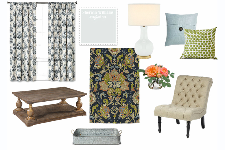
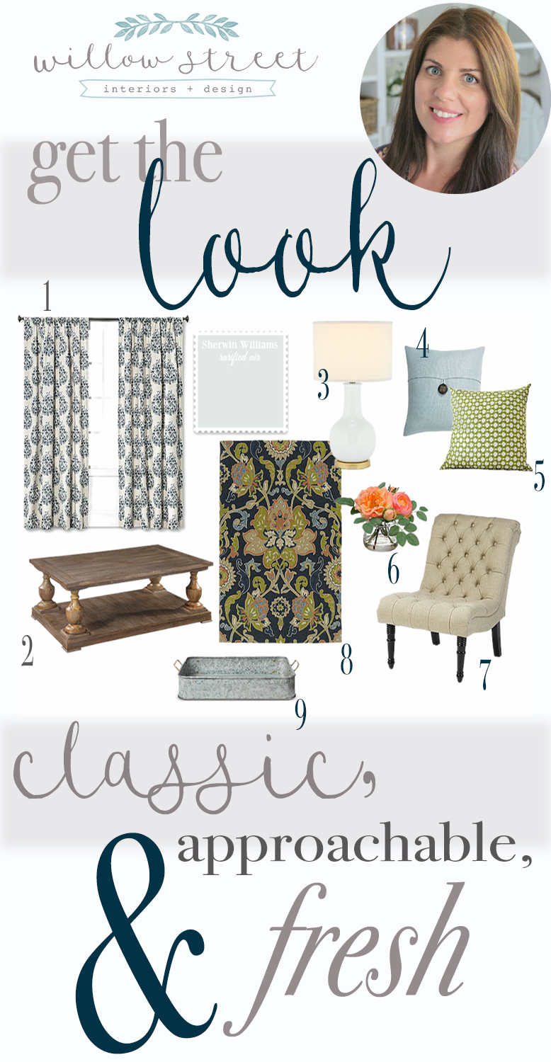
If you like the looks you’ve seen and want to craft your own classic, approachable, and fresh space, pin and save the image below! I’ve put together a mood board and listed all the sources you’ll need to get a similar look in your own home.
1 | 2 | 3 | 4 | 5 | 6 | 7 | 8 | 9
And don’t forget to check out all of the amazing homes and before and after photos that have already been shared this week! Tomorrow, Cassie from Cassie Bustamante will be sharing her beautiful home along with some other very talented ladies, so come on back and take a look! And one final thing, take a look at these stand alone bathtubs if you need bathroom inspo.
Laura ?
MONDAY
TUESDAY
WEDNESDAY
THURSDAY
FRIDAY



Literally magazine worthy! This was beautiful! Most certainly a fresh approach to decorating.
Oh, thank you so much, Jessica!! ?
The rooms definetely feel fresh, classic, and approachable! Isn’t it funny how hard it is to put your own style into words? Hopefully you felt the same happy peace I did when I finally figured mine out!
It really was Melissa! And it felt really good to finally put it into words! ? Happy Thursday!
so pretty! your home is so light and airy!
Thank you so much, Cassie! I’m so looking forward to your tour tomorrow!
I LOVE how you describe your style as approachable. What I love even more is that grey subway tile backsplash in the kitchen and those sconces – WOW! Wonderful transformation. XX
Thank you Caroline! I love you home too!!! 🙂
Pure perfection, Laura! Your description is on point, and I agree, your home is magazine worthy!
Aw, that is so sweet, Iris! THANK YOU!! <3 🙂
Love your home, it is beautiful. Thanks for sharing.
Thank you so much!! 🙂
My jaw is on the floor!! Pinning everything! LOVE it, girl!!
Aw, thank you so much, Karen! So happy I found you through this hop! 🙂
Beautiful! Your home is light, bright, and so comfy!
Thank you, Amy! It’s been fun to finally get to work on all of the fun stuff!
What a beautiful home! It is so warm and inviting. Well done!
Thank you so much, Shelley! xoxo
Laura, your home is so gorgeous! I am so blown away with how your home has evolved and love how welcoming it is. Beautiful job and thanks for joining in to share your home style!
Aw, thanks, Stephanie! I had a blast joining in! Thank you for hosting! 🙂
I love the style words you chose! So welcoming! When I saw the before pics of your master bedroom, I thought it looked pretty good. But then when I saw the afters, Wow! Beautiful!
I know, pretty much all of the furniture stayed the same! It’s crazy what paint and finish work can do, isn’t it?
So many great touches that make it freah and approachable.
I love the greenery in each room!
Thank you so much, Ariel! 🙂
Your befores are beautiful but the afters feel so warm and fresh. Love the changes you made in your gorgeous home.
That’s so sweet of you, Kathy! Thank you! xoxo
Laura, your home is beautiful! You’re right, its so much brighter than it was before. I love all of the little details you have in your kitchen, it’s inspiring me to do some more accessorizing 😉
Aw, thank you so much Jen!
Those are great words! Everything looks lovely–so bright and inviting!
Thank you, Gretchen! ?
Beautiful home!! Where are the gold kitchen pendants from?! They are stunning!