Hey Guys! I really enjoyed designing this master bathroom early last spring and I’m so excited to finally be sharing it with all of you!
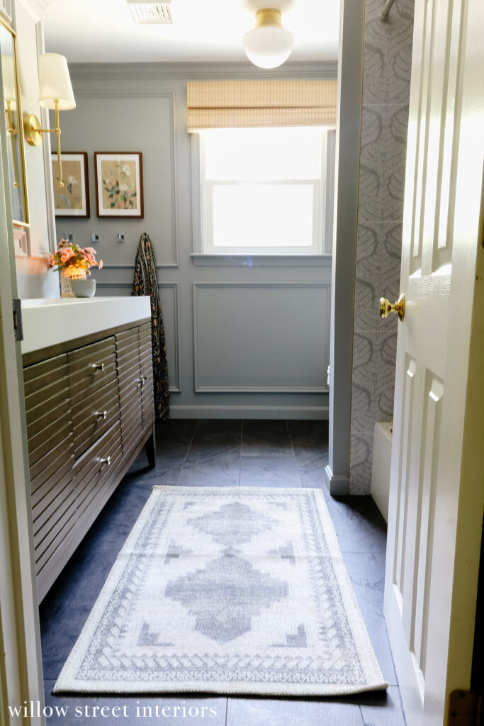
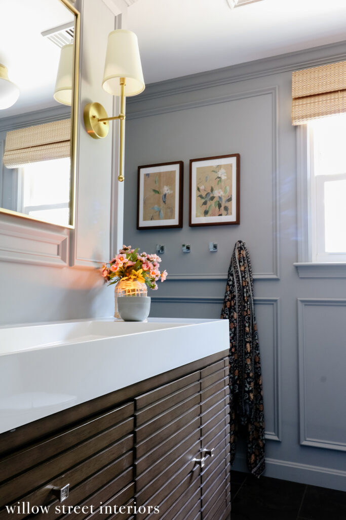
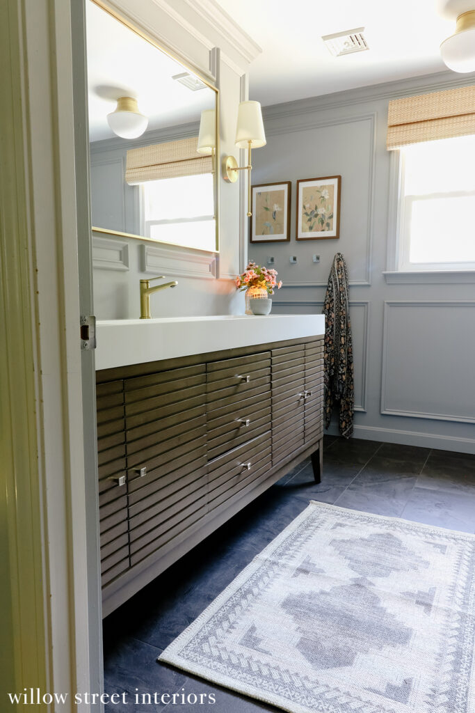
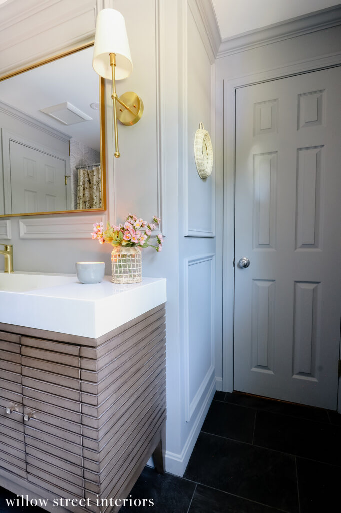
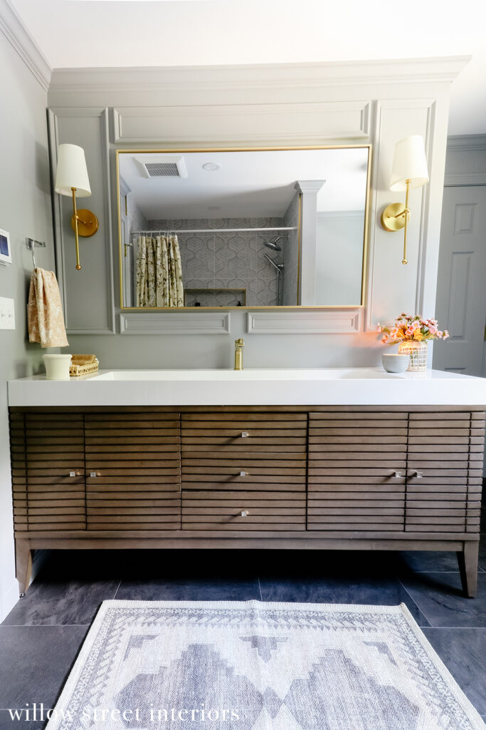
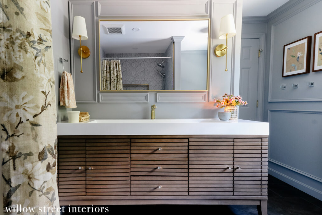
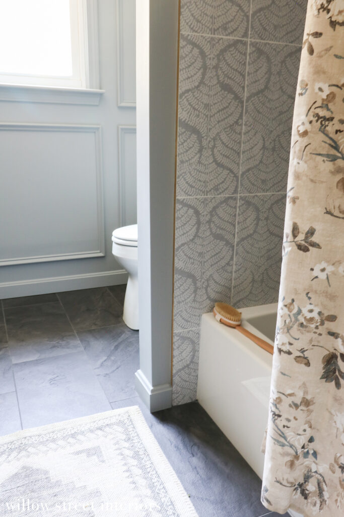
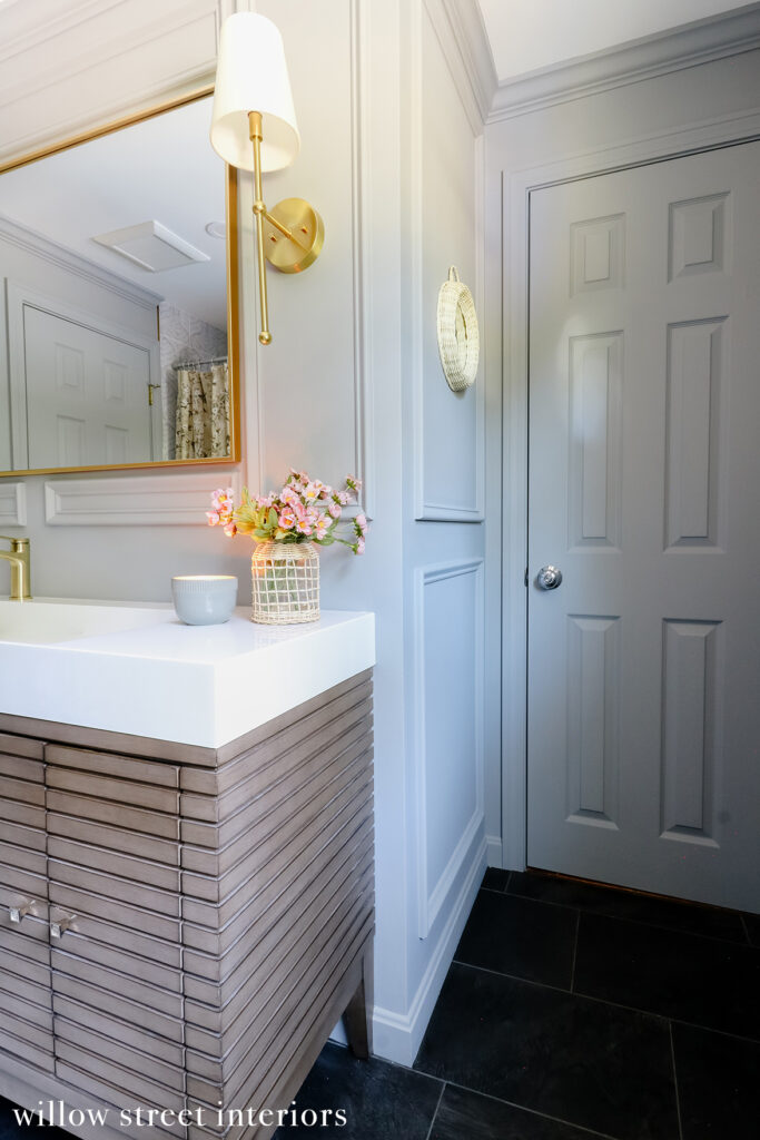
Pre-renovation, this bathroom had a 60 inch vanity that was lacking in storage and was framed into place with a small half wall along its right side, which closed off the space and made the bathroom feel even smaller than it actually is. I decided to have my contractor tear the wall out to make space for this much more functional (and pretty!) 72 inch. It offers loads more storage and makes the space feel more expansive and properly scaled than the smaller vanity did.
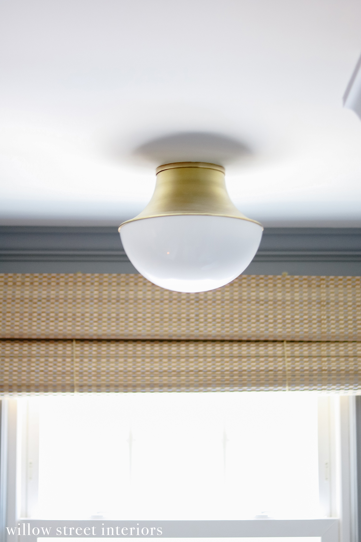
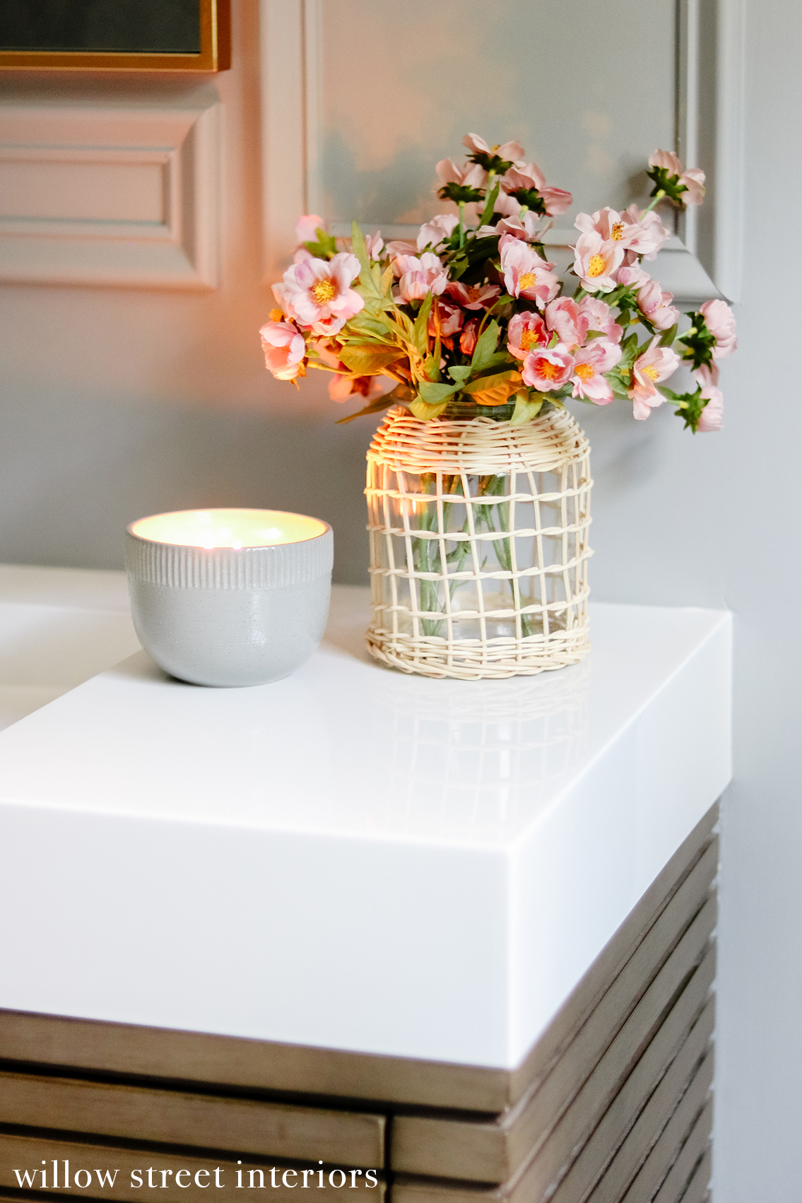
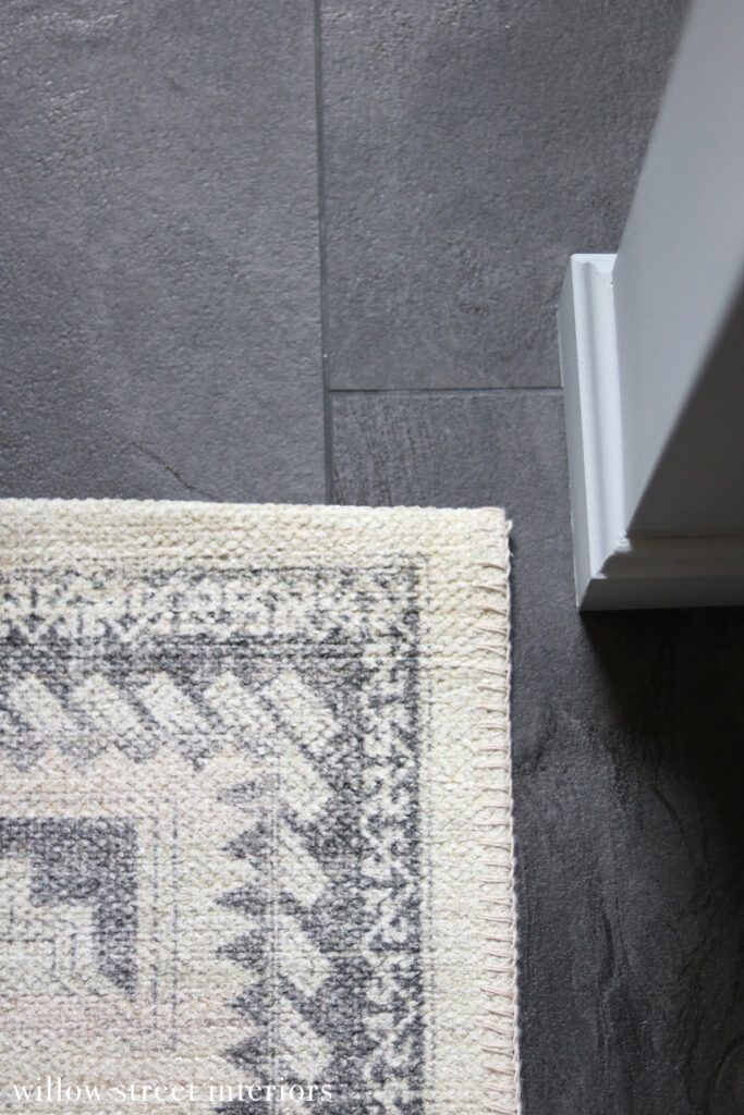
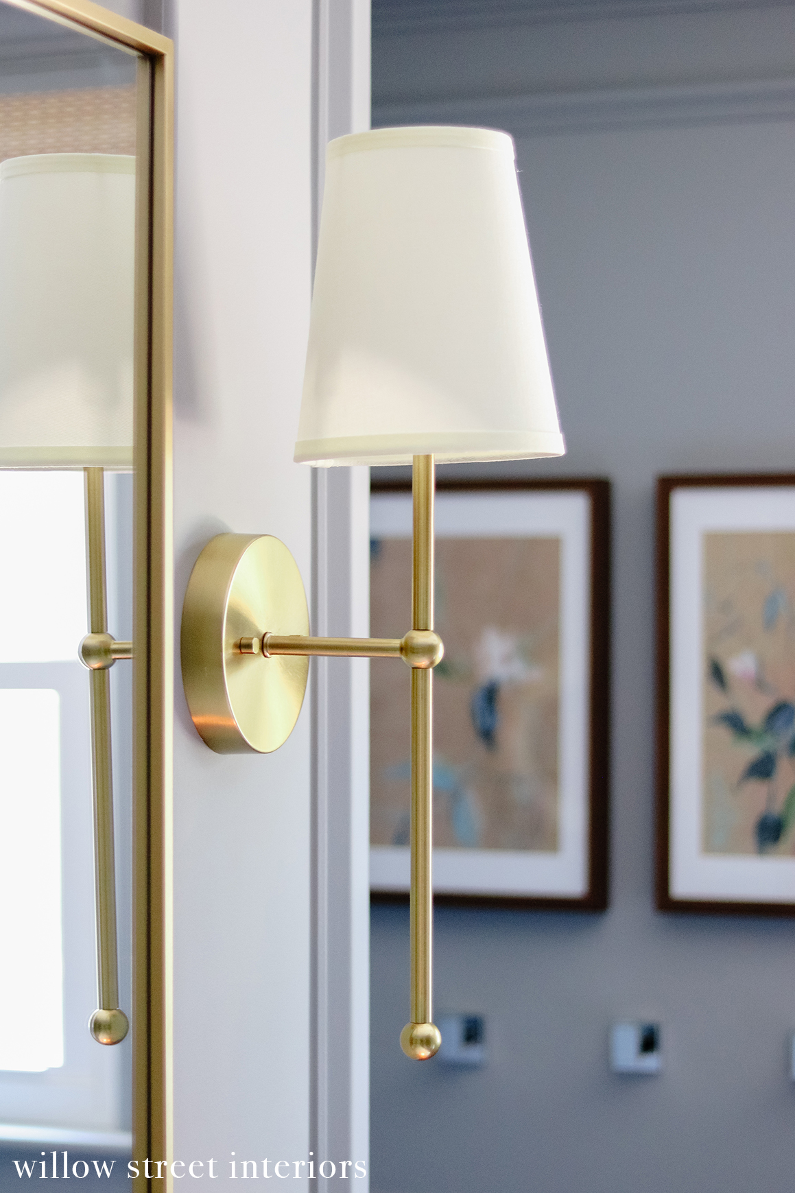
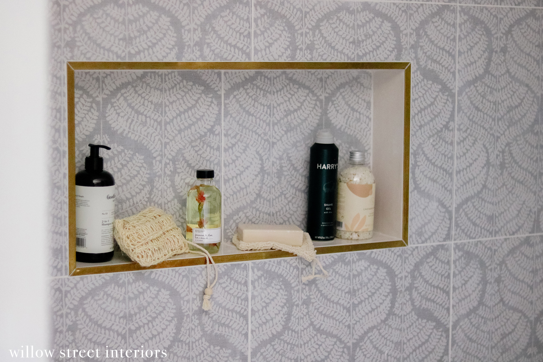
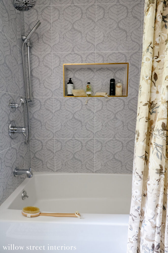
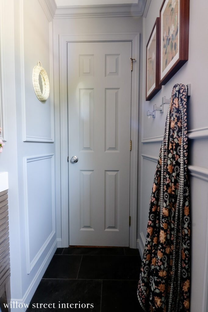
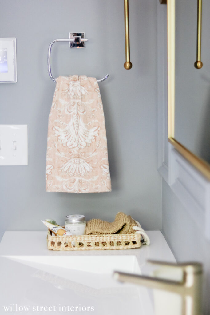
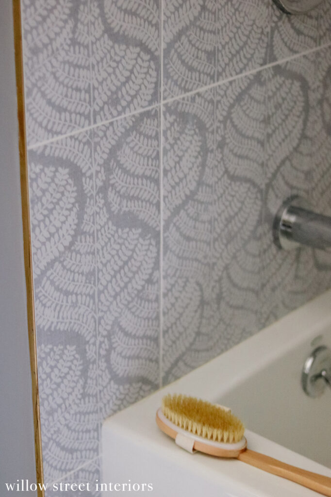
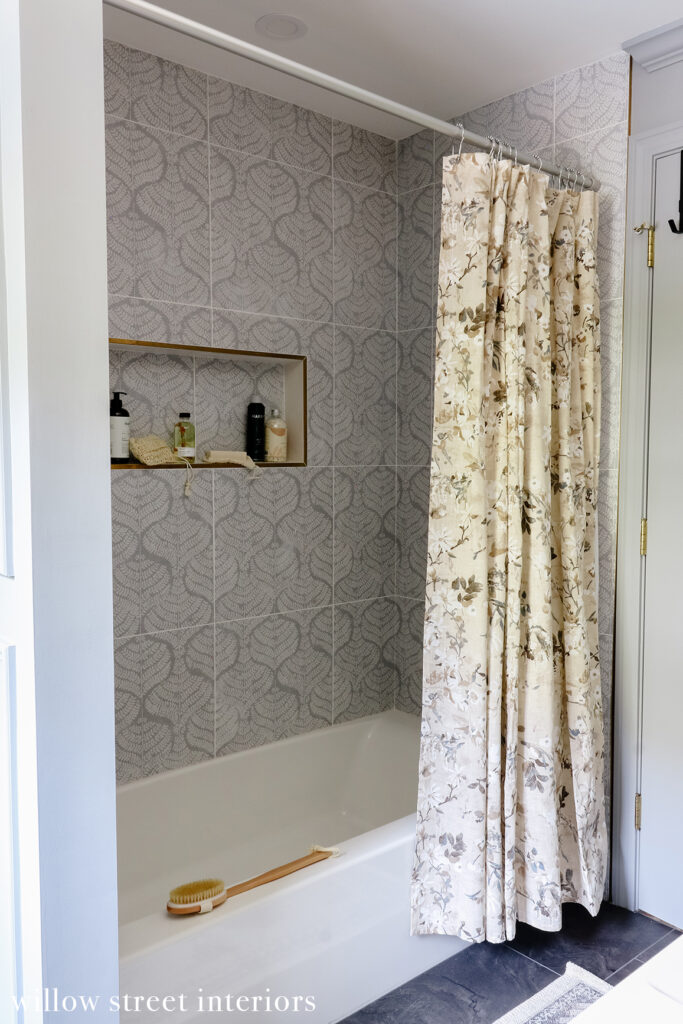
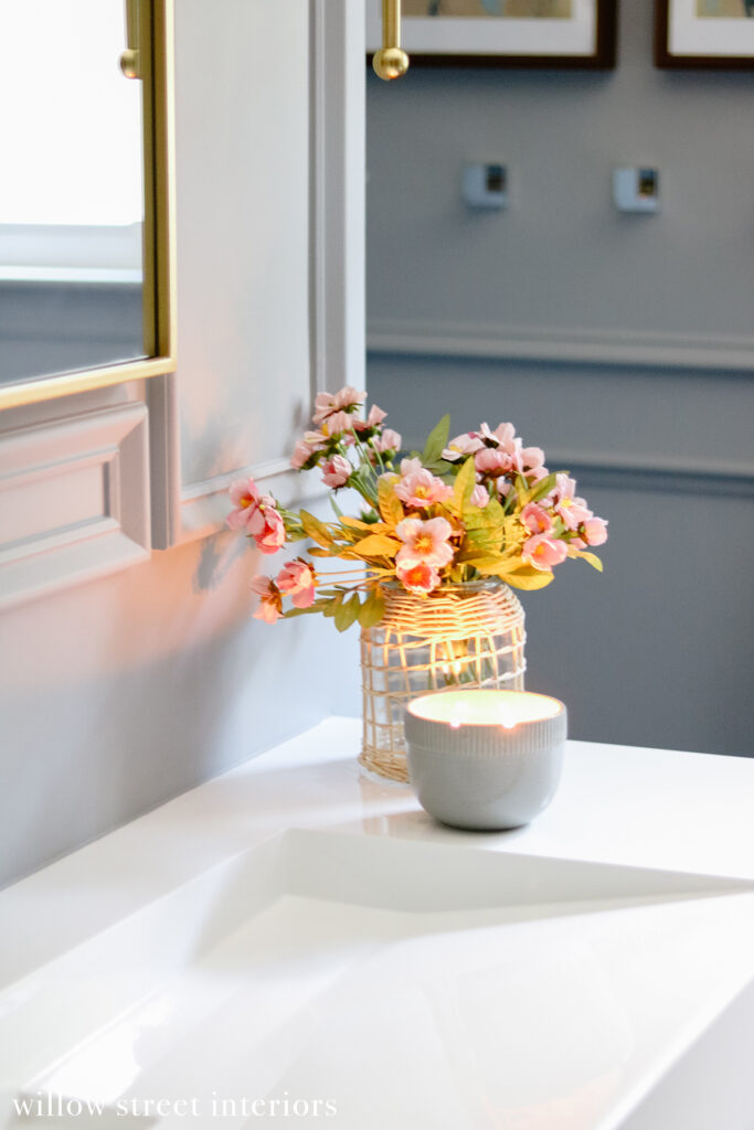
I also wanted to add lots of traditional interest in here, so I came up with a very traditional molding design to do just that. I still wanted to keep a youthful and fresh aesthetic though, so I decided to add a bit of unexpected tension with a modern vanity and this Annie Selke floral porecelain tile for fun! From the lighting, to the paint, to the texture of the vanity and the slate floors, I’m completely smitten with this space, and I couldn’t be happier with the end result! Here are the photos, and sources are at the end. Oh, and the paint color is Benjamin Moore Slate, lightened by 20%. Enjoy!

[show_shopthepost_widget id=”4835935″]

[show_shopthepost_widget id=”4835935″]

[show_shopthepost_widget id=”4835935″]
And that’s about it, you guys! What do you think?
xo, Laura

 A Bohemian Girl’s Bedroom {To Grow With}
 Creating a Cozy Space for Less
 My Home Style Blog Hop {Mix, Match, and Coordinate Edition}
 A Green and White Thanksgiving Table